In this blog
series I will set apart all the steps needed to get this demo up and running on
your own. I will use the text in this post, as well as screen shots and video's
explaining it step by step. So if you're already (somewhat) familiar with
Forms, Power Automate and/or Power BI streaming datasets, feel free to go
directly to the video's and start building your own demo right away. Otherwise,
keep reading and eventually you'll come across all the resources as well.
In Part 1, I already explained what the reason
behind this demo is, and what I used it for in my presentations. I made a start
with the demo and showed you how to make a Form and set up a streaming dataset
in Power BI.
In Part 2 of this
blog series I will show you how to glue it all together with Power Automate and create a report out
of the data. There are some things you need to know in the streaming dataset,
to properly show the output in your Power BI report. And lastly, I will show
you a trick to get your data refreshed live while respondents are answering the
questions, but without refreshing your browser!
Create an automation flow
In Power Automate you can create flows manually or with the help of a
template. I used a template for my first flow, but if I search for this same
template in the gallery it actually doesn't show up.
 |
| Power Automate template |
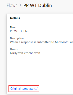
I do have the URL
because you can check that in your current flows. I resubmitted it as a
template because I think it's quite useful:
You can use that
template here,
or create the steps yourself manually. It's actually not that hard if you take
a look at the template.
Create a Power BI report
When the previous
steps have been completed, we have built ourselves a working solution, we only
have to visualize the results from the dataset. OK, I know, I could also use
the default reporting of Microsoft Forms, but that uses pie charts… And you
know: every time you create a pie chart, God kills a kitten! :-)
 |
| Microsoft Forms default report |
Before creating a
report it's good to have some data to create the visuals from. To do that, in Forms, clicking on Preview lets you
enter the form as a user. You can then create a report by connecting to the
streaming dataset, live from Power BI Desktop.
As you saw in the
video, I created a basic report with the questions I used in the form. You can
create any kind of fancy report with this approach of course.
If you use for example a multiple choice question in your form, with
multiple possible answers, I use the DAX formula CONTAINSSTRING or CONTAINSSTRINGEXACT to get the values out of the JSON-string.
You write 1 measure per choice and then plot them in a chart. I'm not sure if
there's an easier way of doing this, also maybe with a dynamic number of
values. Let me know in the comments if you figure this out :-)
Share the Form
Last but not
least, we also want to share our form with our audience, right? You can do this
by creating a shorter URL with any of the URL shortener services like bit.ly, tinyurl.com
or Google. You then share this link in the first
few slides of your presentation and even have it visible while attendants are
walking in prior to the start of your session. That way they have a minute to
fill in the form and you don't have to wait on their answers during the
presentation.
Create a Live Dashboard
So the trick for
creating a live refreshing view of the answers coming in, is to create a
dashboard of the visuals in the Power BI service. So pin all the visuals you
need from the report to a dashboard, maybe also add the URL to the form and
you're done. You could also refresh the browser every few seconds (either
manually or with a browser extension in Chrome). But I do think the automatic refresh in a dashboard looks
cleaner, otherwise you're also depending on the speed of the WiFi for loading
your whole page every time you refresh.
Recap
As
you have seen, setting up this Power Platform demo is actually not that
difficult, you just have to know the steps and maybe go through them once to
remember them. It does however add a lot of value to a presentation in my
opinion. After the PowerPlatform World Tour Meetup in Dublin I had some
good feedback from people that wanted to use this setup in their next
presentation. From Mary Fealty (B | @Br0adtree) and Marc Lelijveld (B | @MarcLelijveld) I already heard they implemented this, so that's nice to hear!
Mary even added a
great feature to the report.
Hey Nicky, used the Forms & Power Automate solution today. Worked a treat. I added a date field so I could filter out my test cases in #PowerBI, there were many. 😊— Mary Fealty | Broadtree Solutions (@Br0adtree) November 6, 2019
Let me know in the comments or on Twitter if you use this or another method or if you have any questions!


